This project was centered around creating a magazine publication with a consistent and unique visual identity spanning multiple spreads and other pages. I decided to create a magazine that focuses on giving LGBTQ+ artists a stage for their work to be highlighted, titled PLATFORM. I then gathered interviews with queer artists and other stories to feature in my publication.
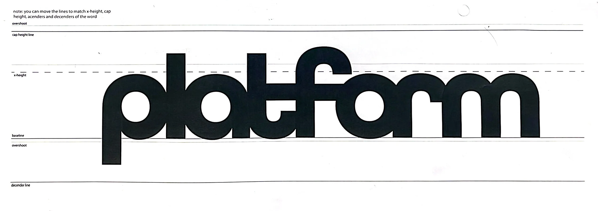
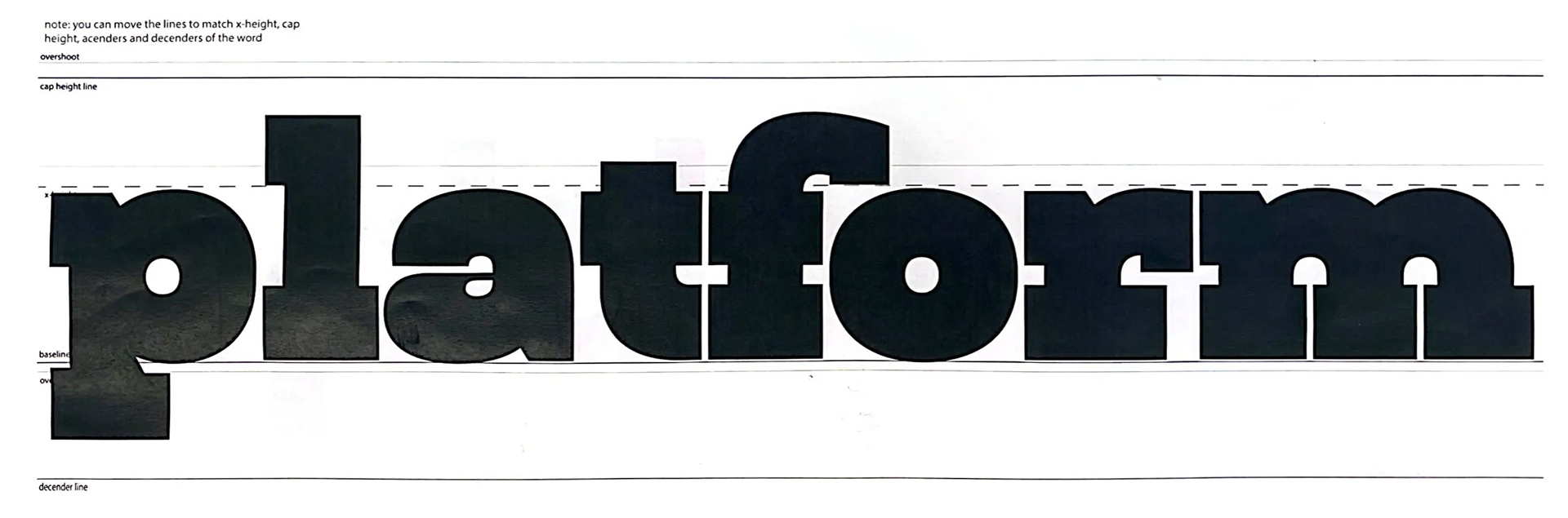
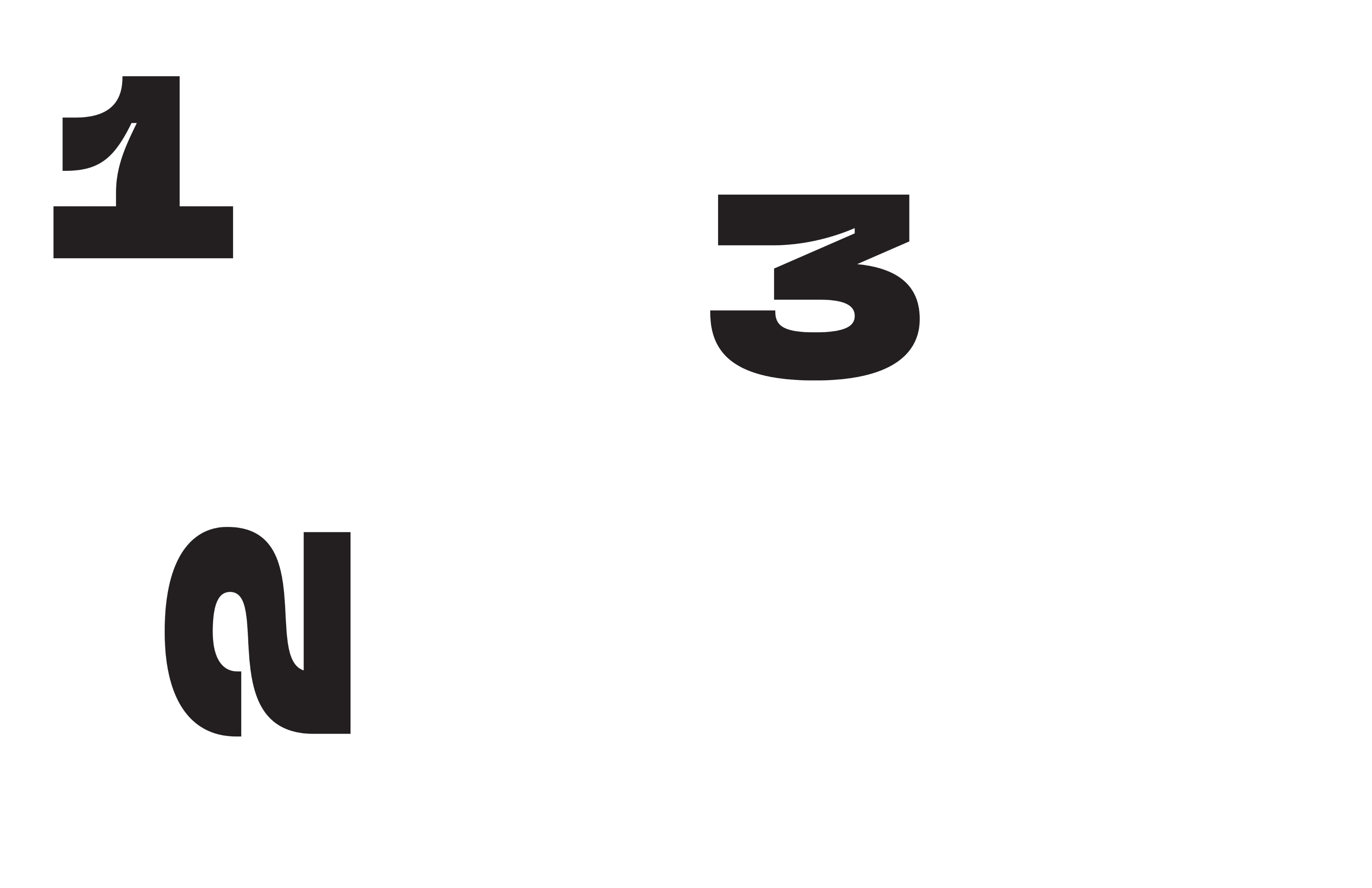
Wordmark Sketches
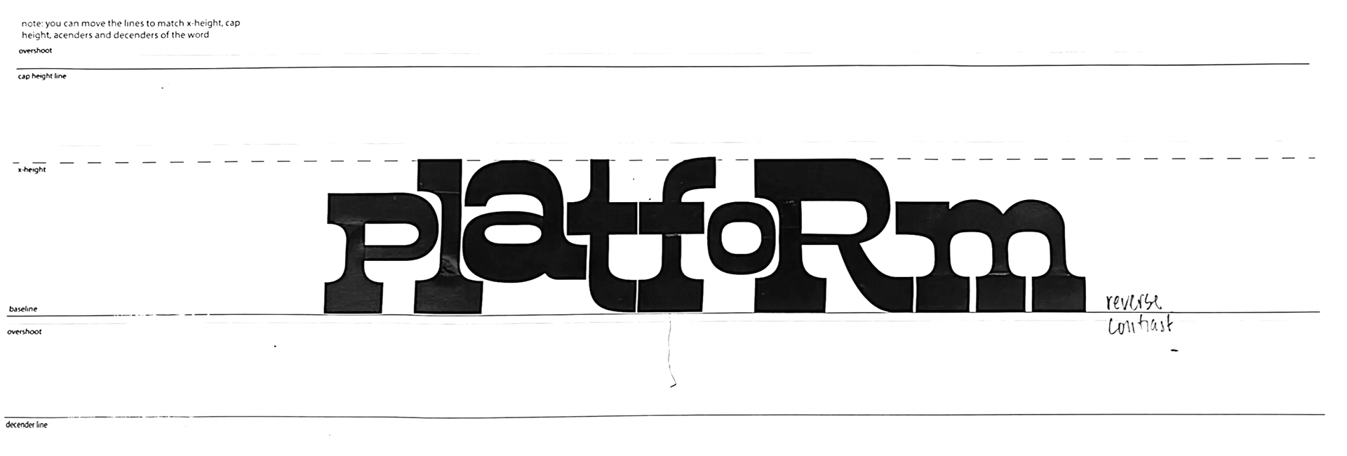
I began by experimenting with several typefaces and altering the letterforms to create a wordmark. I searched for typefaces that were bold and carried a unique visual identity with them.
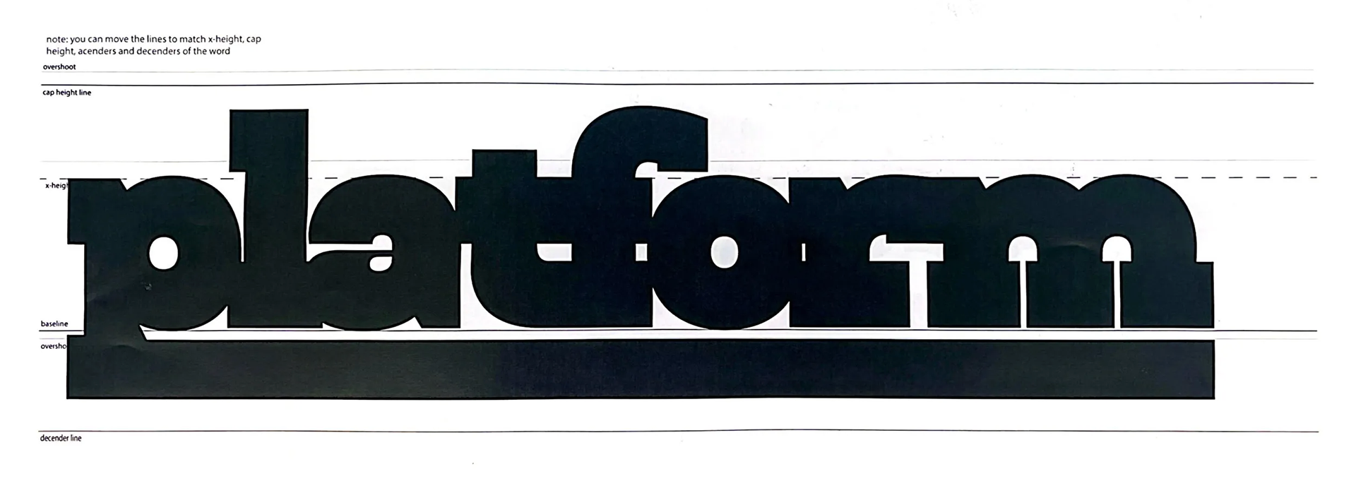

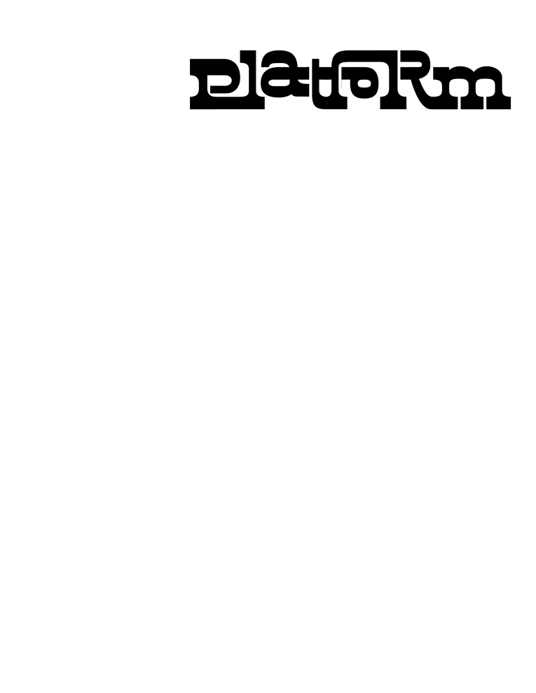
Finalized Wordmark
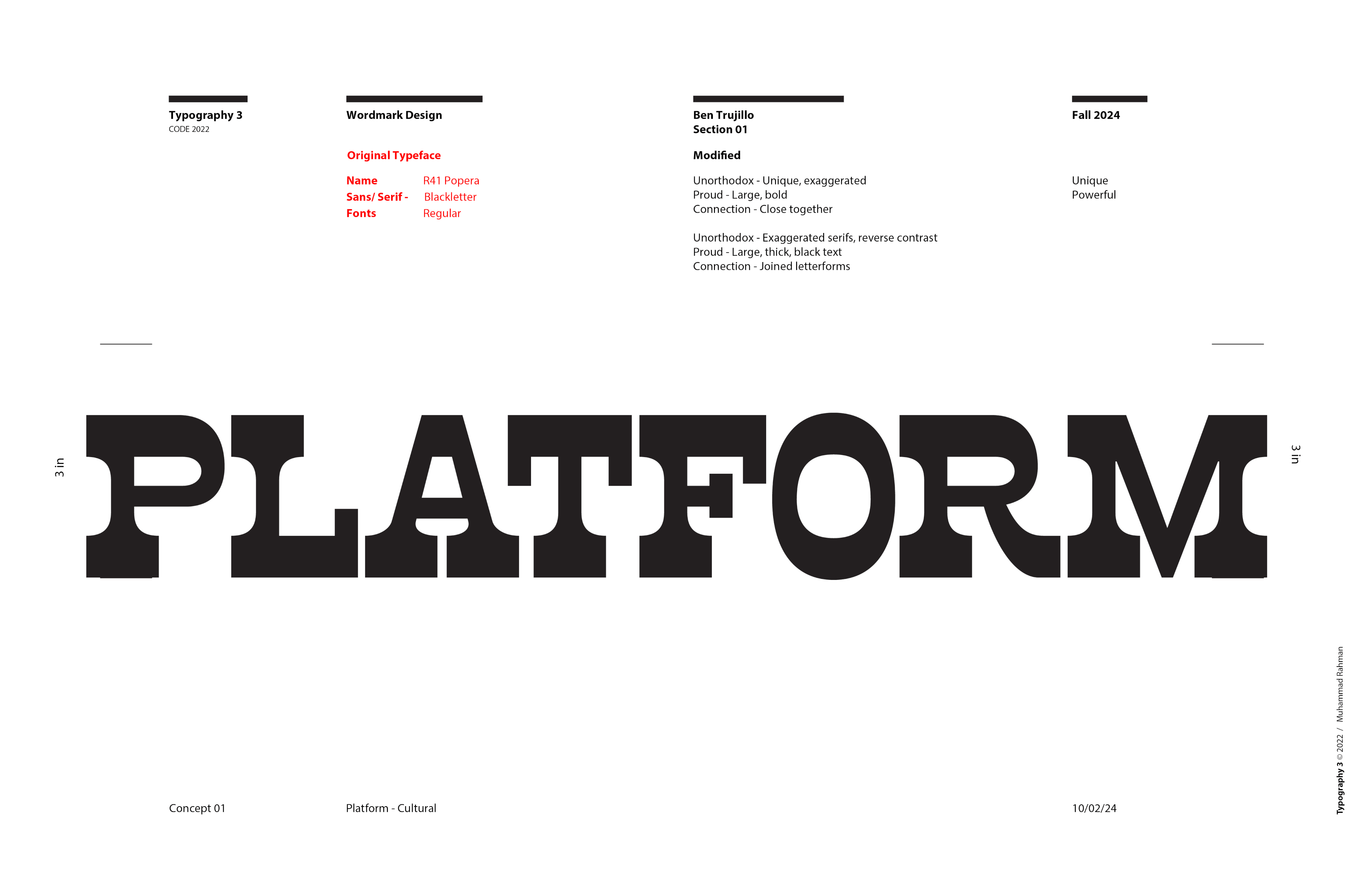
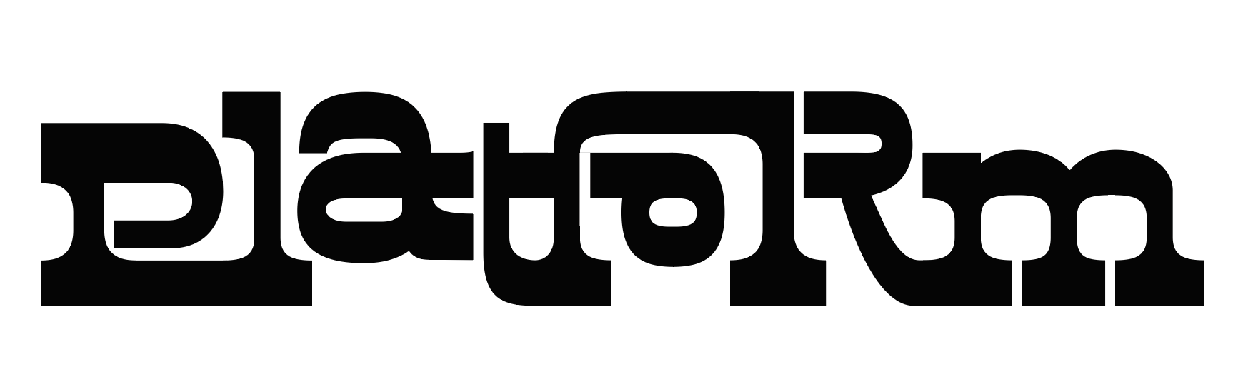
I decided on a typeface called R41 Popera due to its unique use of line weight and reverse contrast. Additionally, the letterforms flow uniquely and help to give the entire word mark a distinct feel.
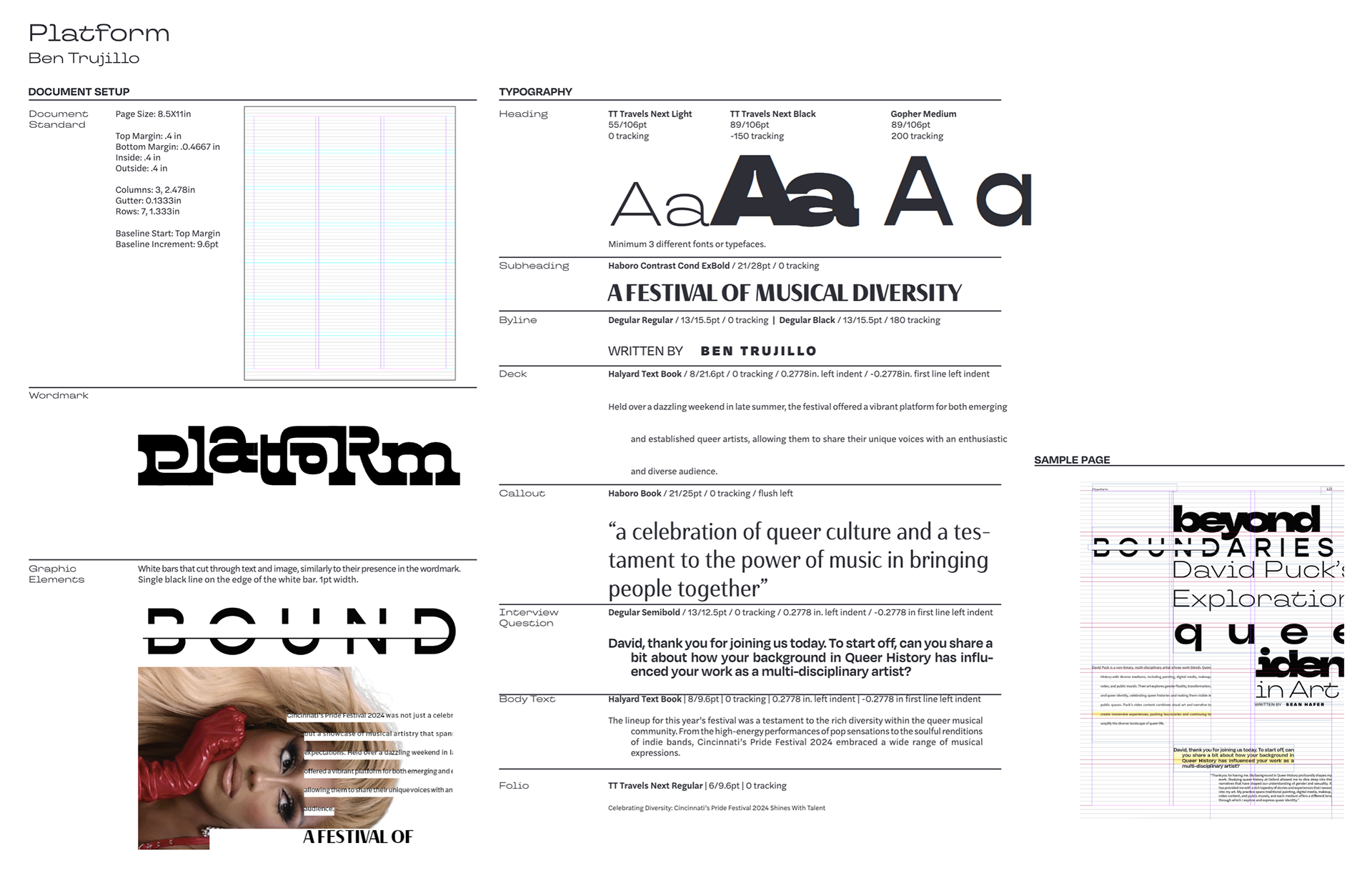
Finalized Visual System
Using my finalized word mark as an inspiration, I experimented with the content I had gathered and worked to create a full visual system that I could use to create even more pages in my publication. I wanted to keep the same bold feeling my word mark had, so I used a number of bold, free-flowing typefaces.
Spread Experimentation
Having finalized my visual system, I used it to create 4 different spreads containing the text from the interviews and stories I had gathered for this project. This GIF file contains the various different layouts I experimented with.

Table of Contents Experimentation
To go along with the article spreads, the magazine needed a table of contents. This was a unique opportunity to explore the visual system I'd established without having to accommodate for a large amount of body text.
Cover Experimentation
Lastly, to complete the publication, the magazine would need a cover. Like the table of contents, this was an interesting opportunity to focus mostly on imagery and visual elements within my visual system as opposed to focusing on the body text.
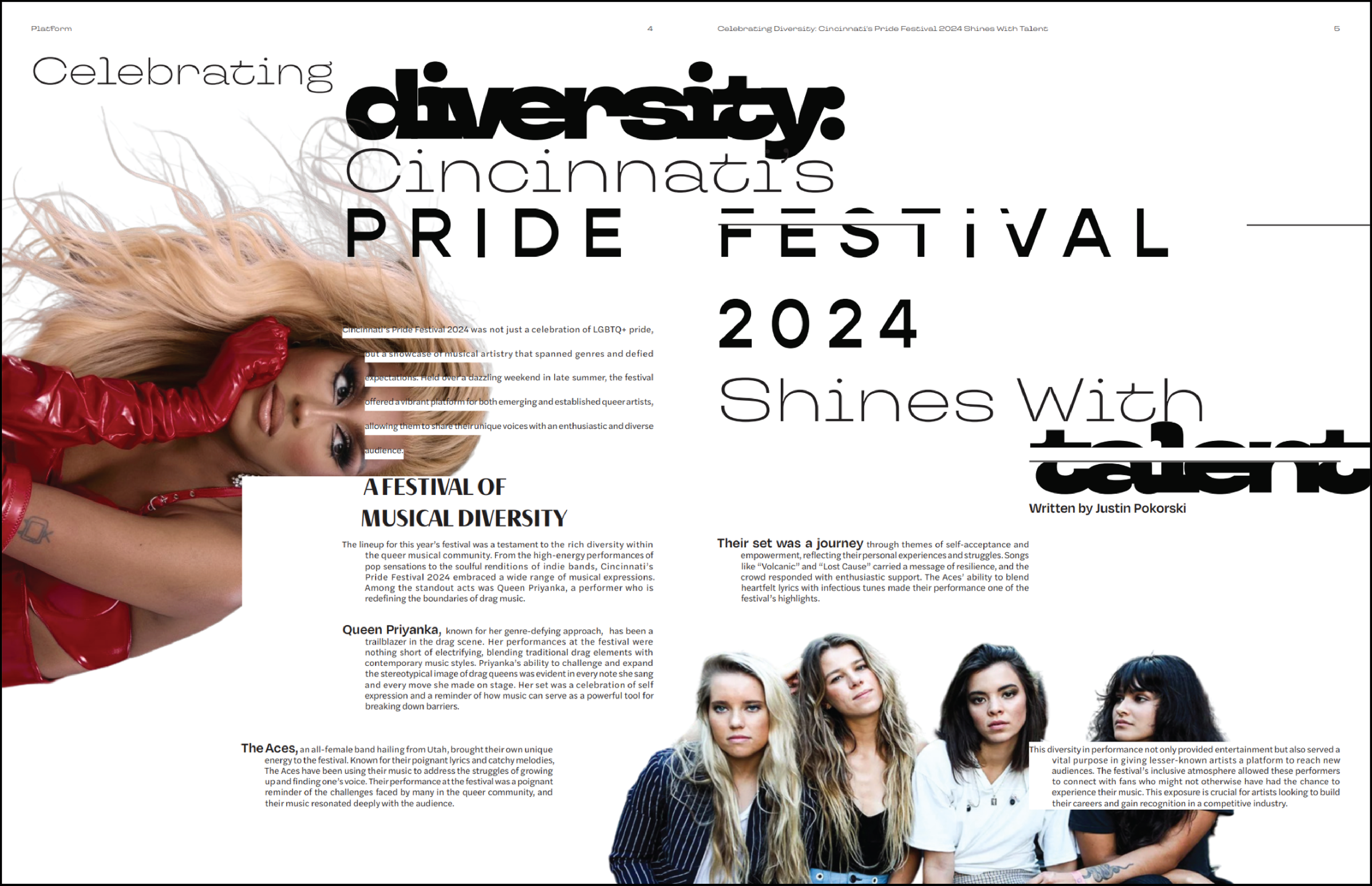
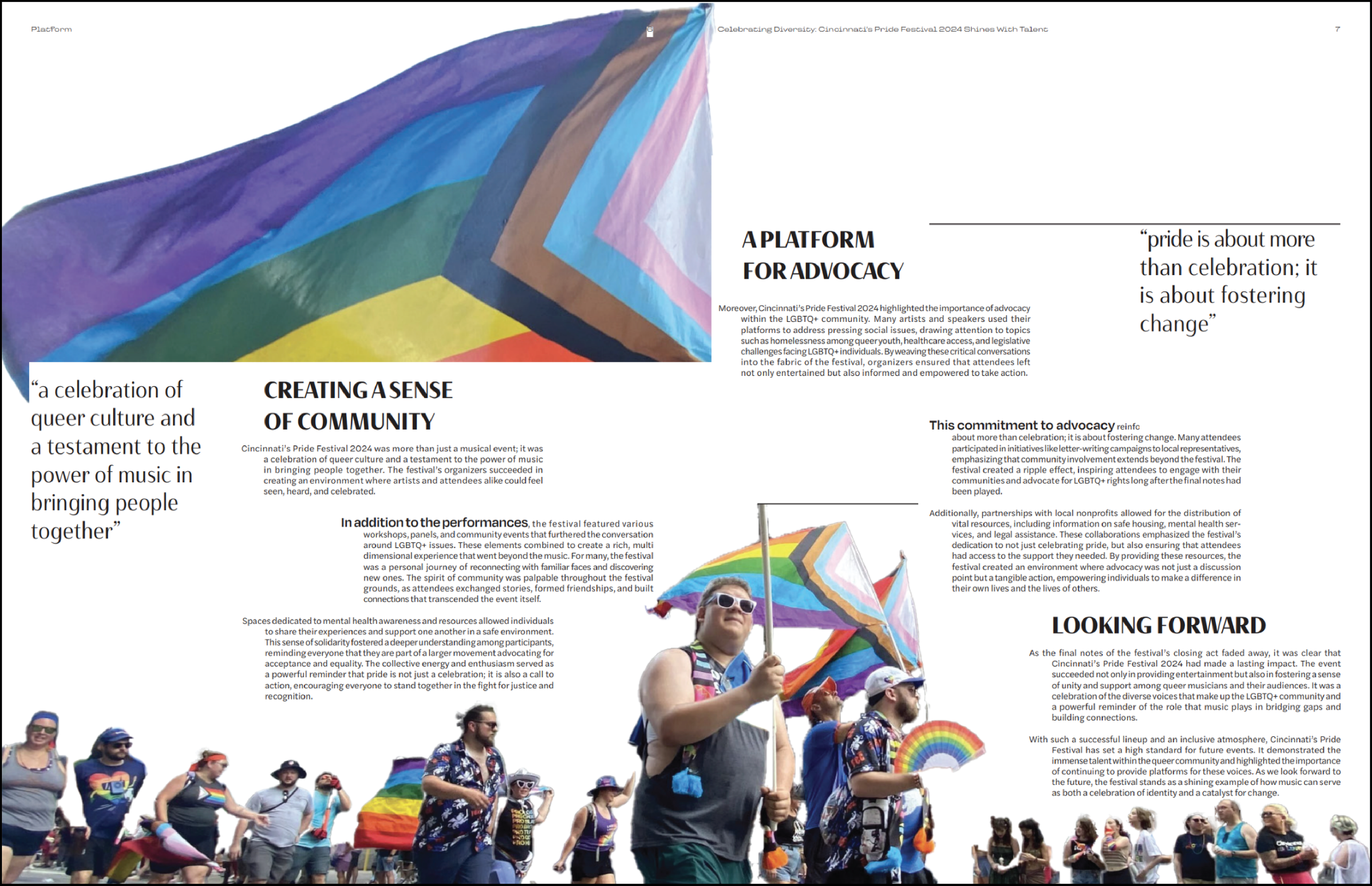
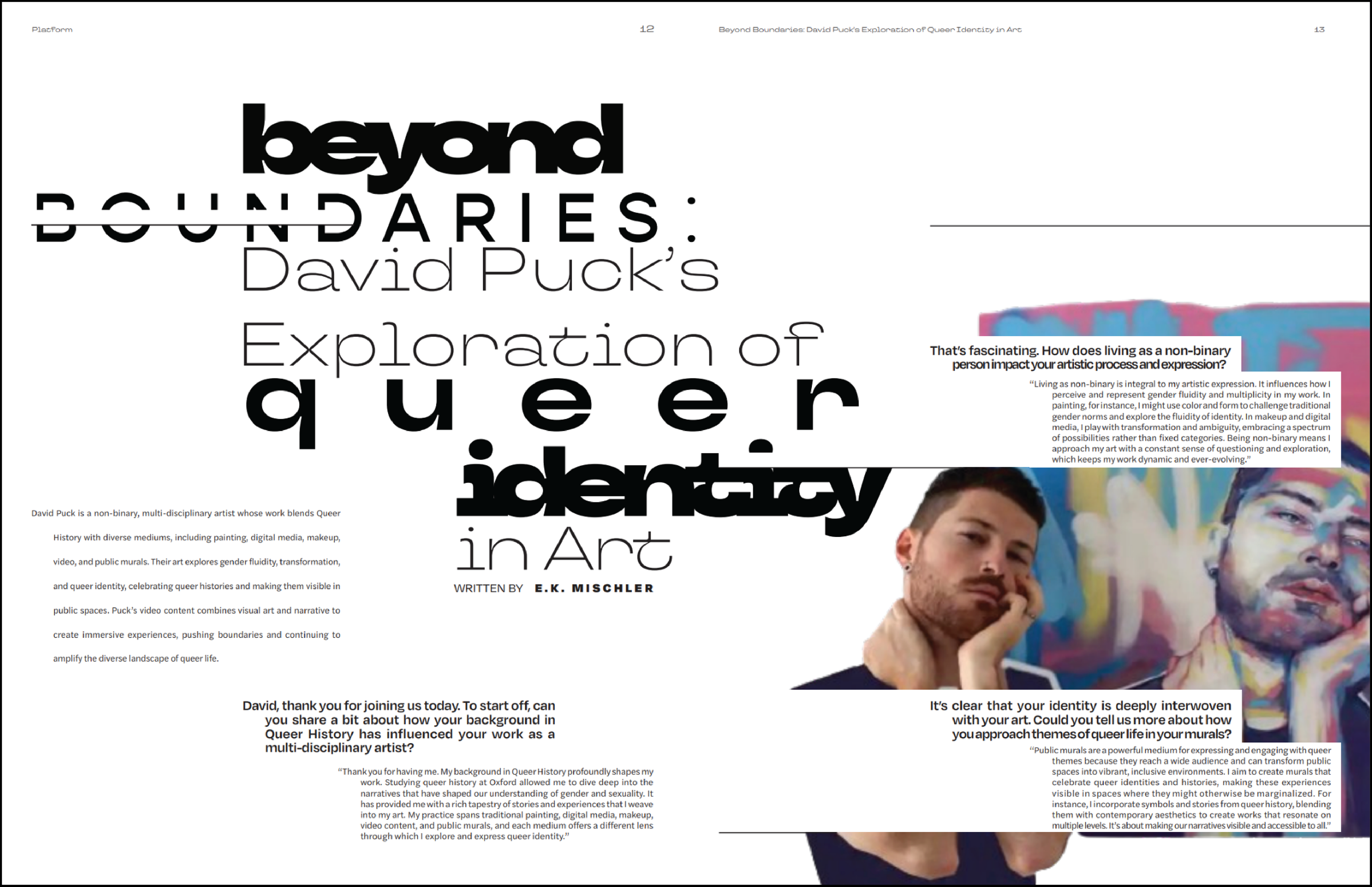
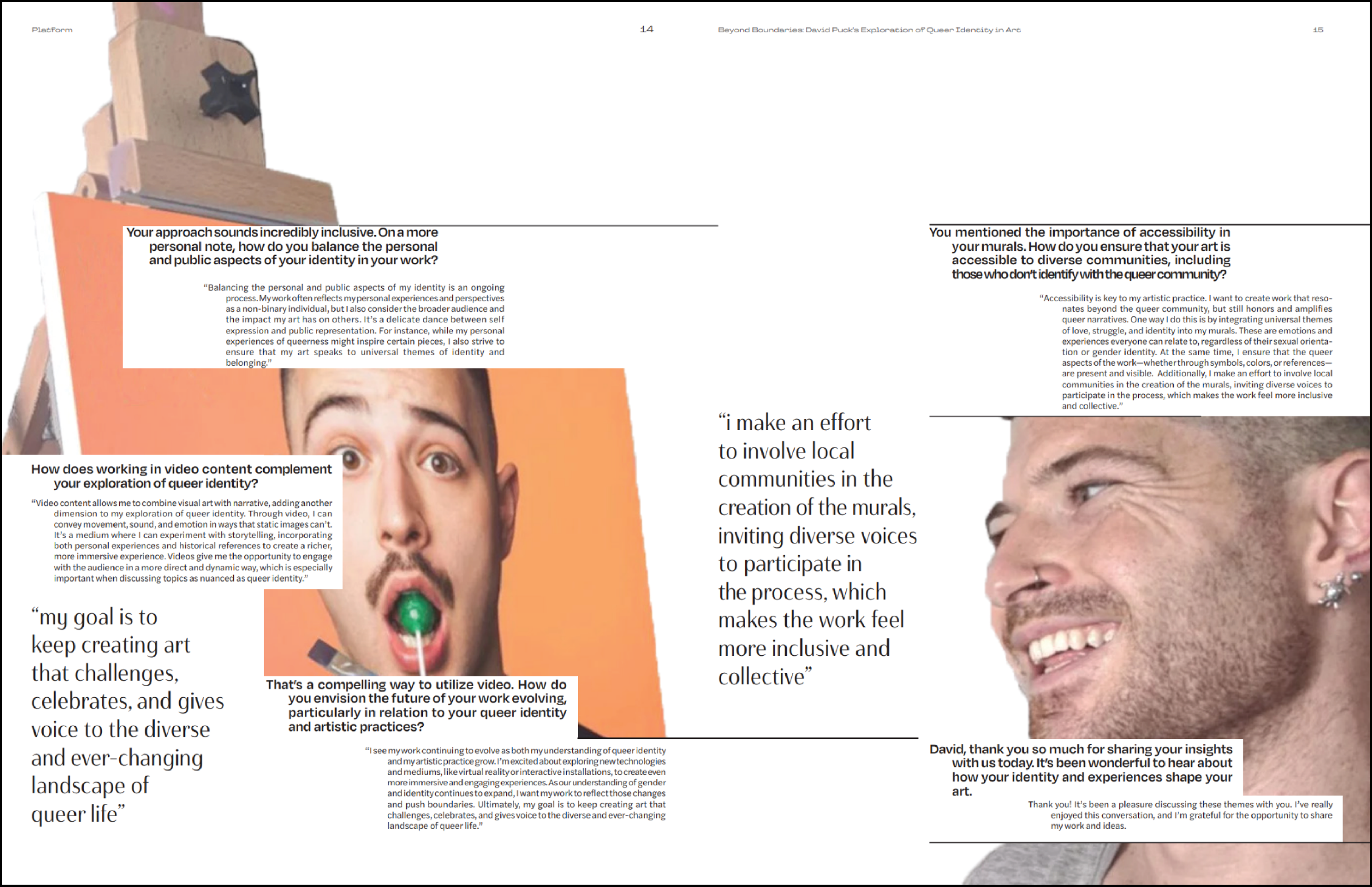
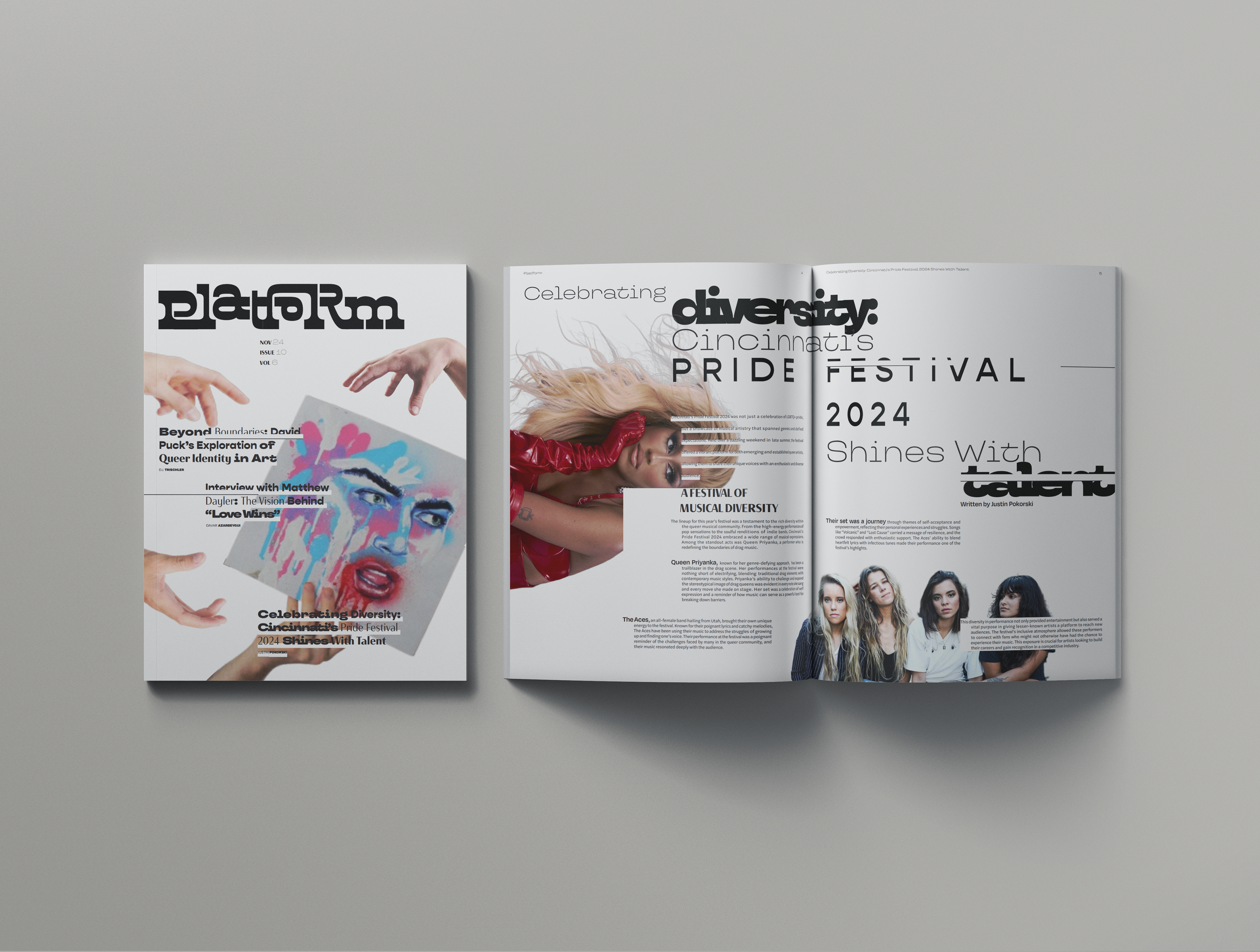
Finalized Publication
The final designs for the Platform publication are pictured below.