

This project was centered around creating a fictional brand identity for a café called The Painted Mug. I aimed to create a cohesive brand identity that spanned across multiple different works, while also utilizing a number of the design skills I’ve learned.
Brainstorming
First, I stopped to think about what kind of café I wanted to make. After going through multiple options, I settled on a café that doubles as an art studio. I decided there would be a mascot, a logo, two advertisements, and a menu.
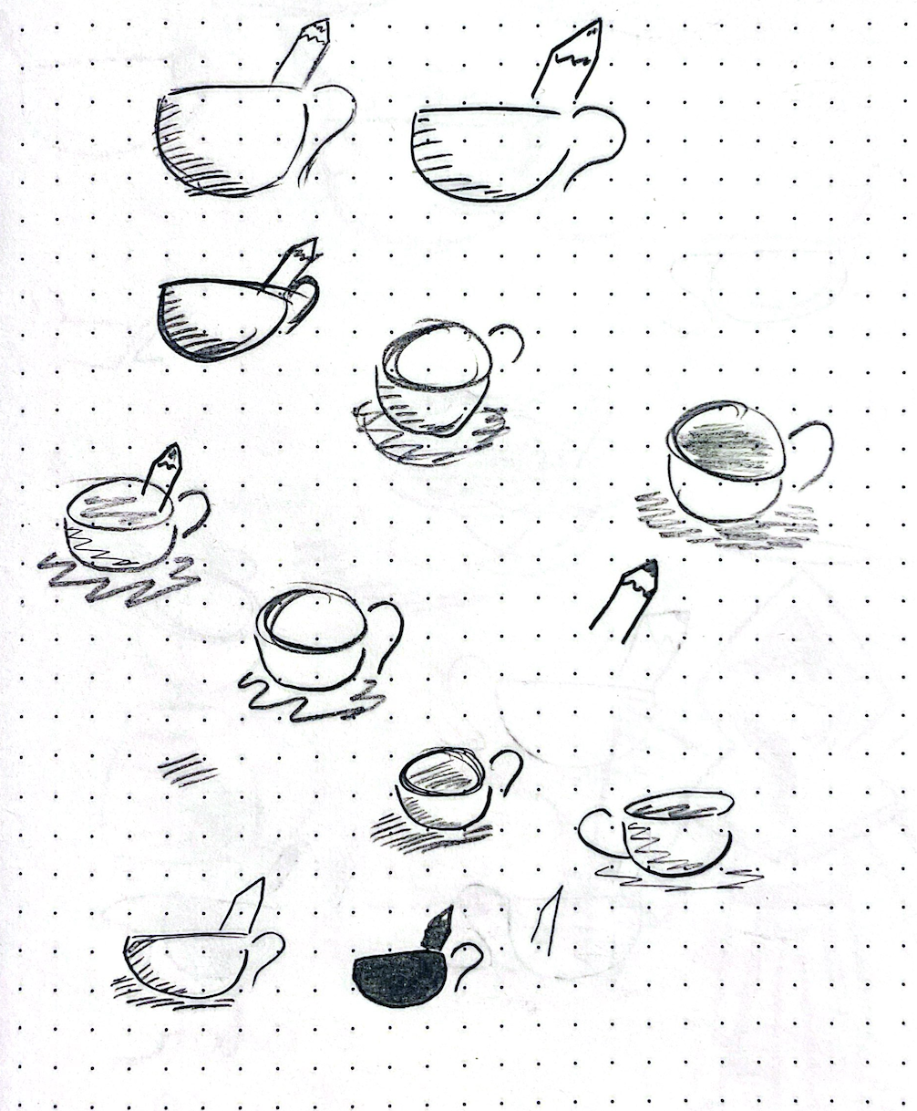
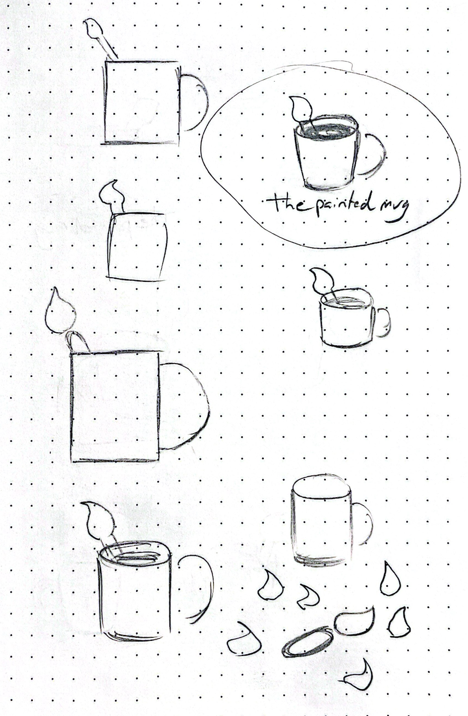
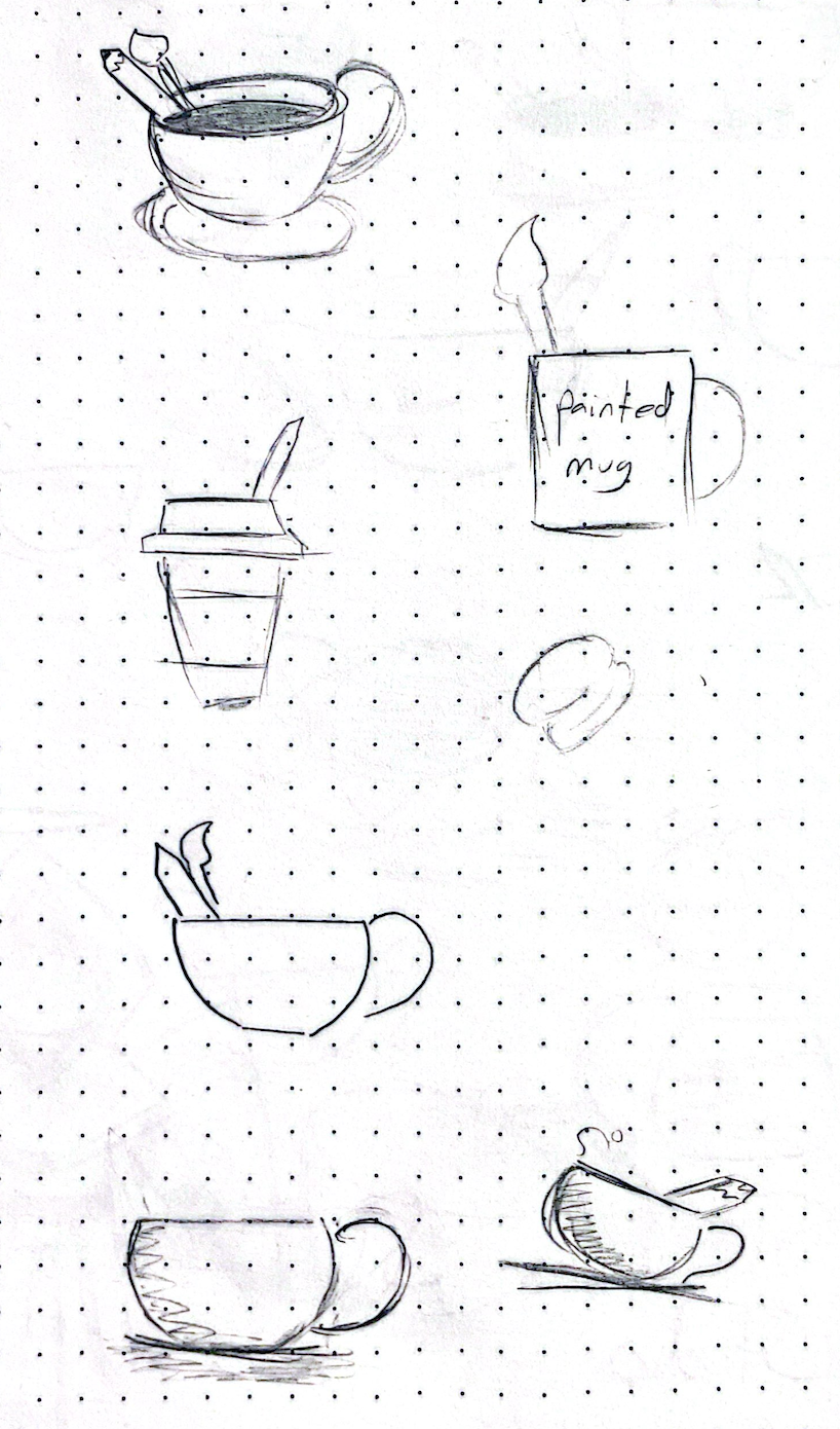
Logo Experimentation
I wanted to create a logo that made the two biggest elements of the café immediately clear, so I worked to incorporate artistic visual elements into a design that also communicates the brand is a café.

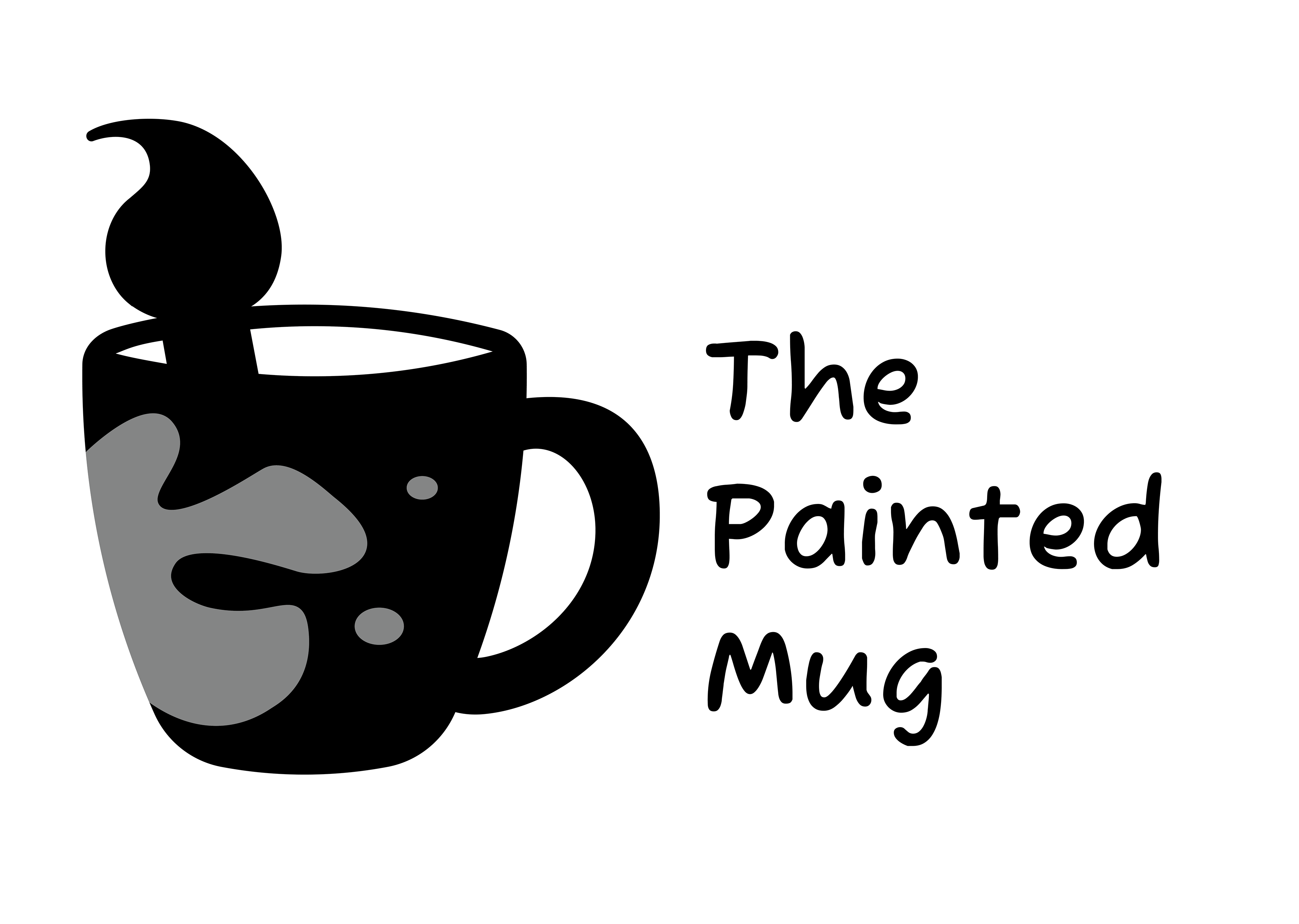
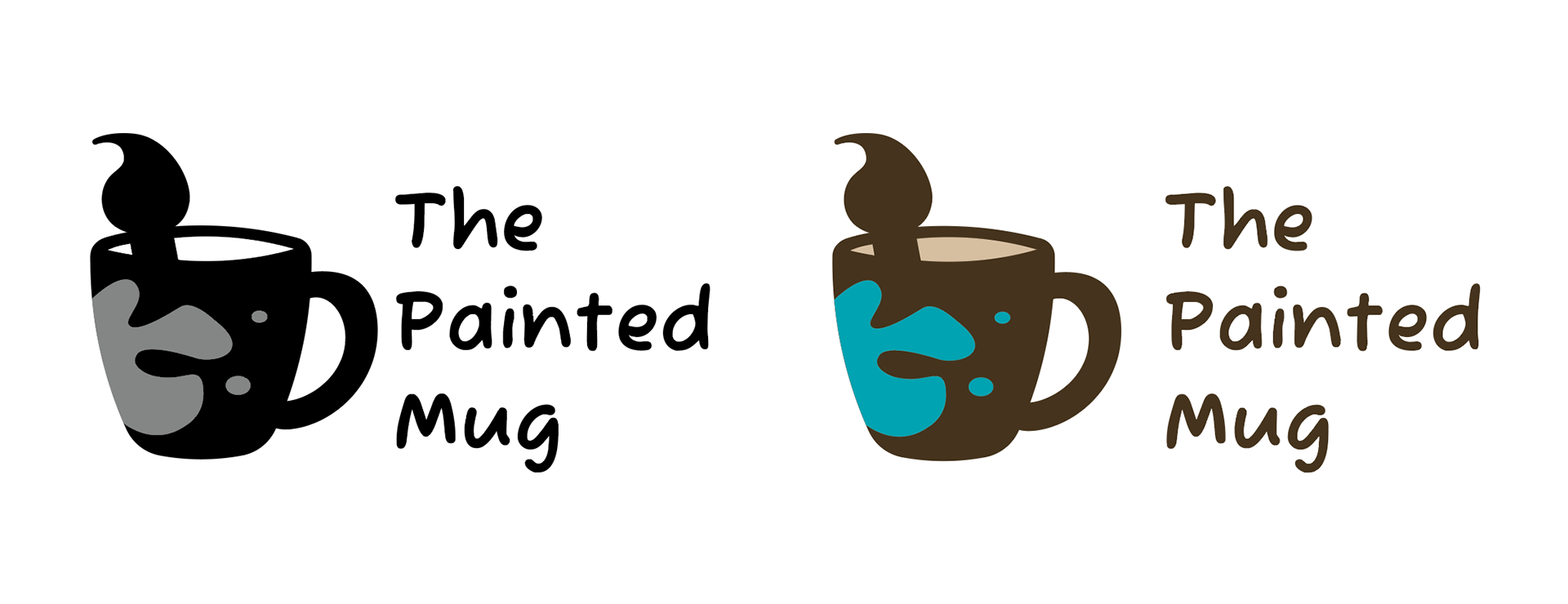
Finalized Logo
After multiple iterations physically and digitally, I settled on a final logo - a coffee cup with a paint splatter and paintbrush incorporated into the design as well. I wanted the typeface to be handwritten and friendly to communicate the feel of the café.
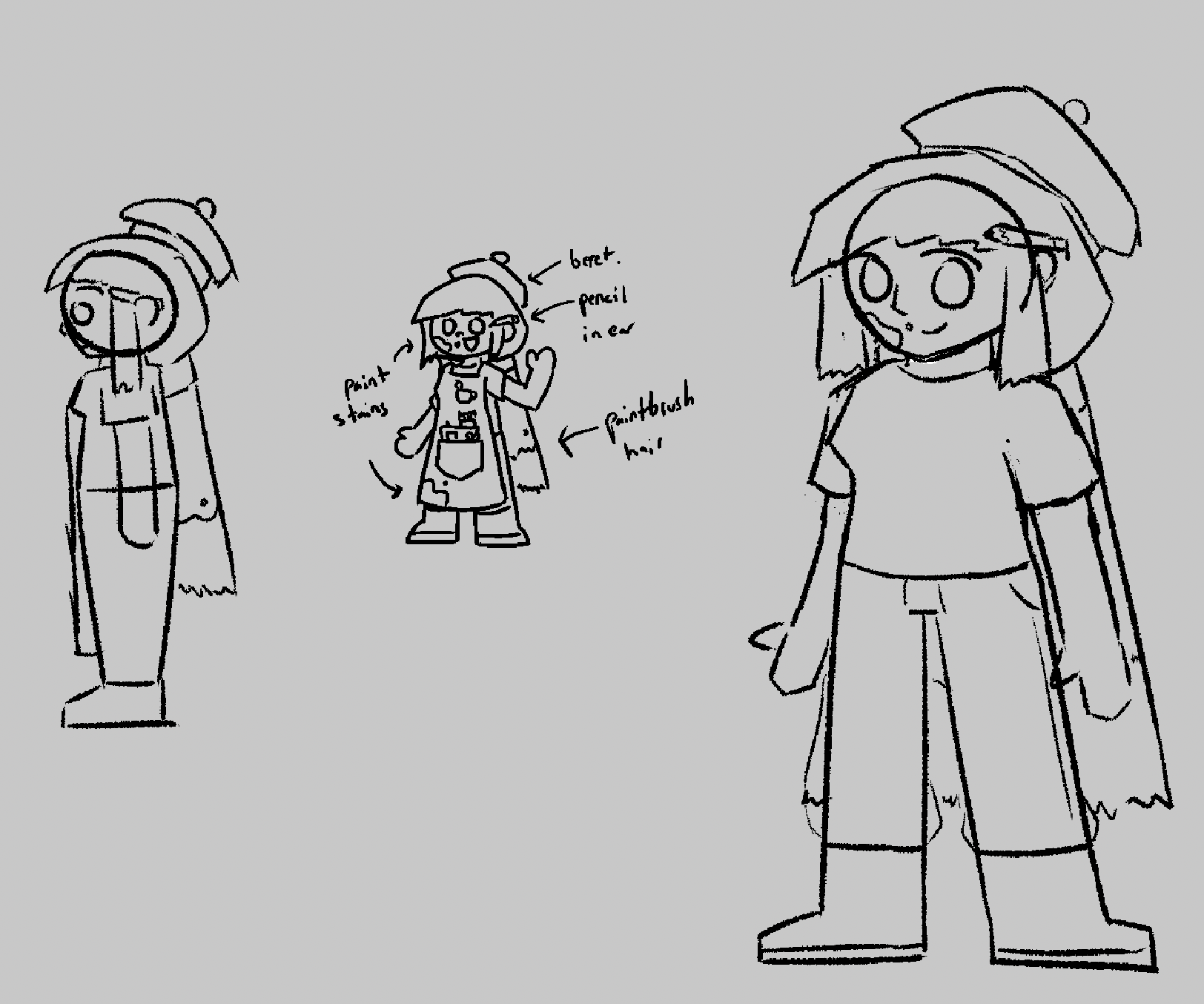
Mascot Sketches
I decided to include a mascot so I could further show the friendly atmosphere of the café. I felt that a mascot would not only help create a cohesive identity across multiple elements of the project, but it would also be a fun way to communicate the artistic side of the Painted Mug.

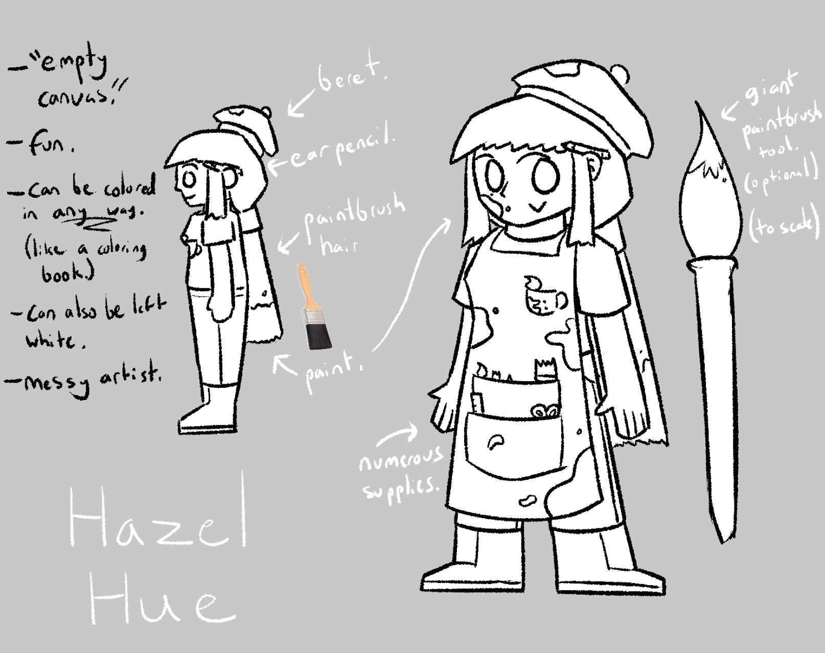
Finalized Mascot
I settled on a design that is intentionally monochromatic. I envisioned that the character could serve as a “blank canvas” of sorts, embodying the creative spirit that the café seeks to feed.
Advertisement Sketches
Next, I wanted to create 2 advertisements that utilized the logo and mascot designs I made earlier. I aimed for a lighthearted, almost comedic feeling in each advertisement, utilizing the artistic traits of the mascot while also using the opportunity to practice my photography skills.
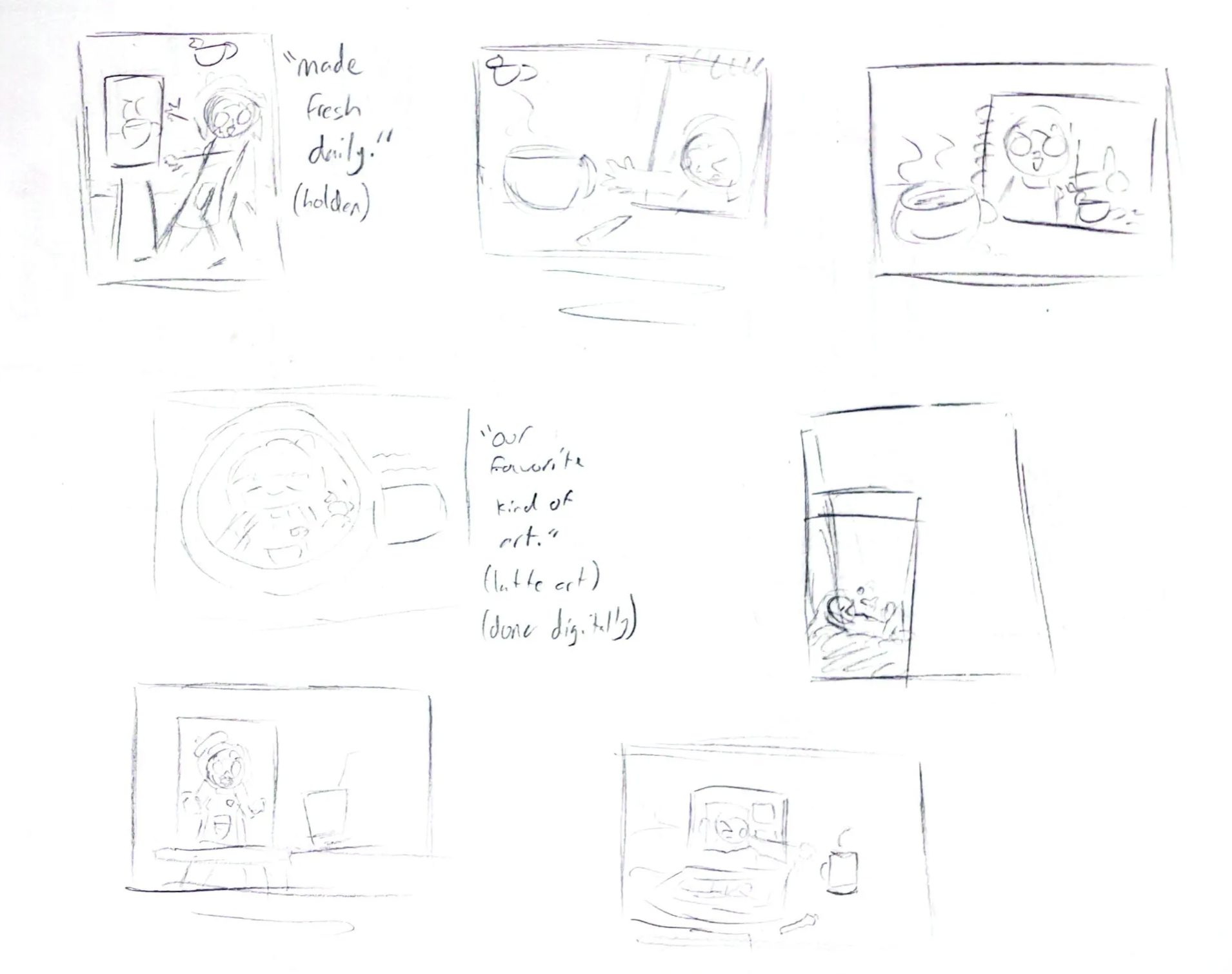


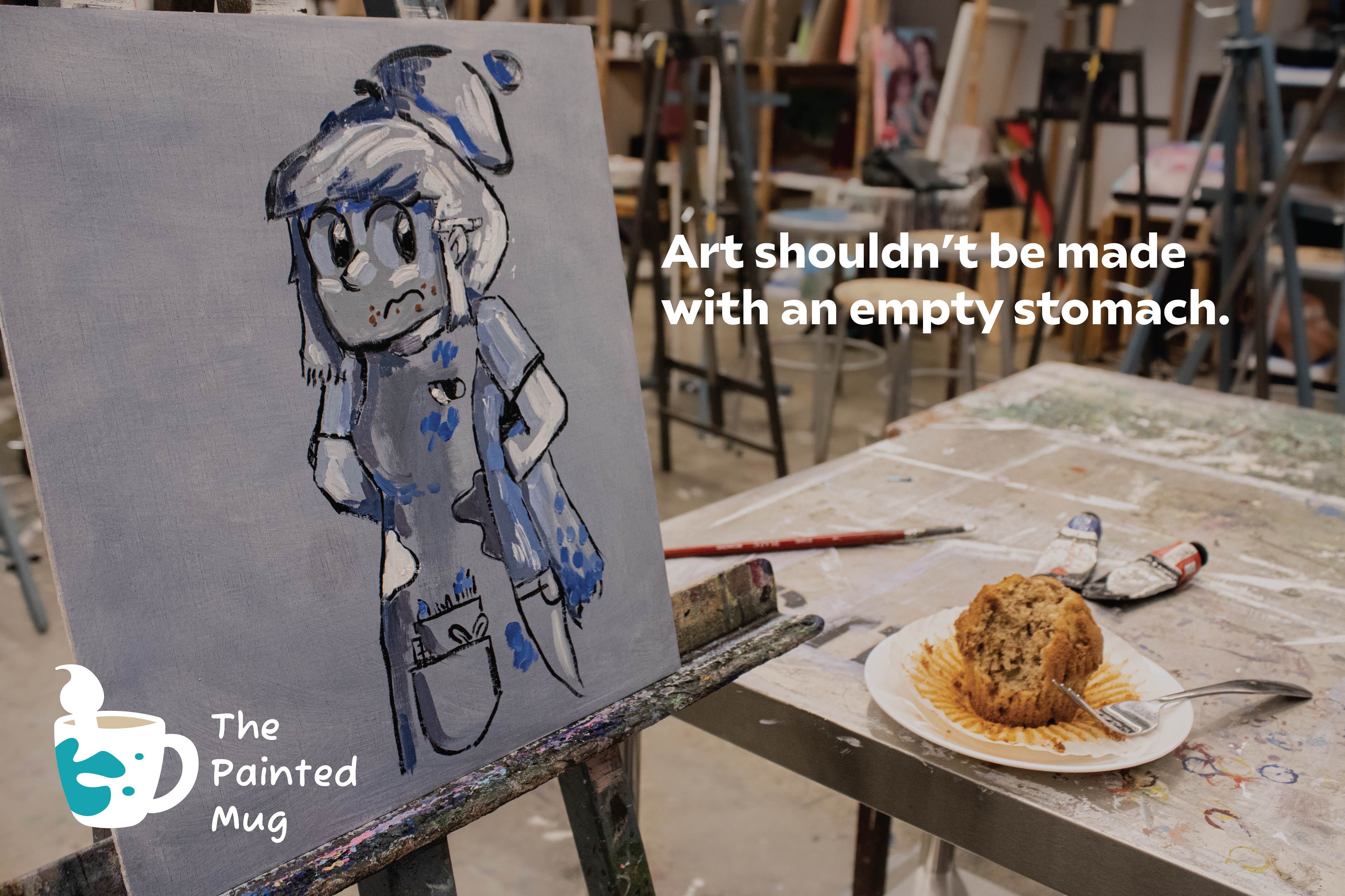
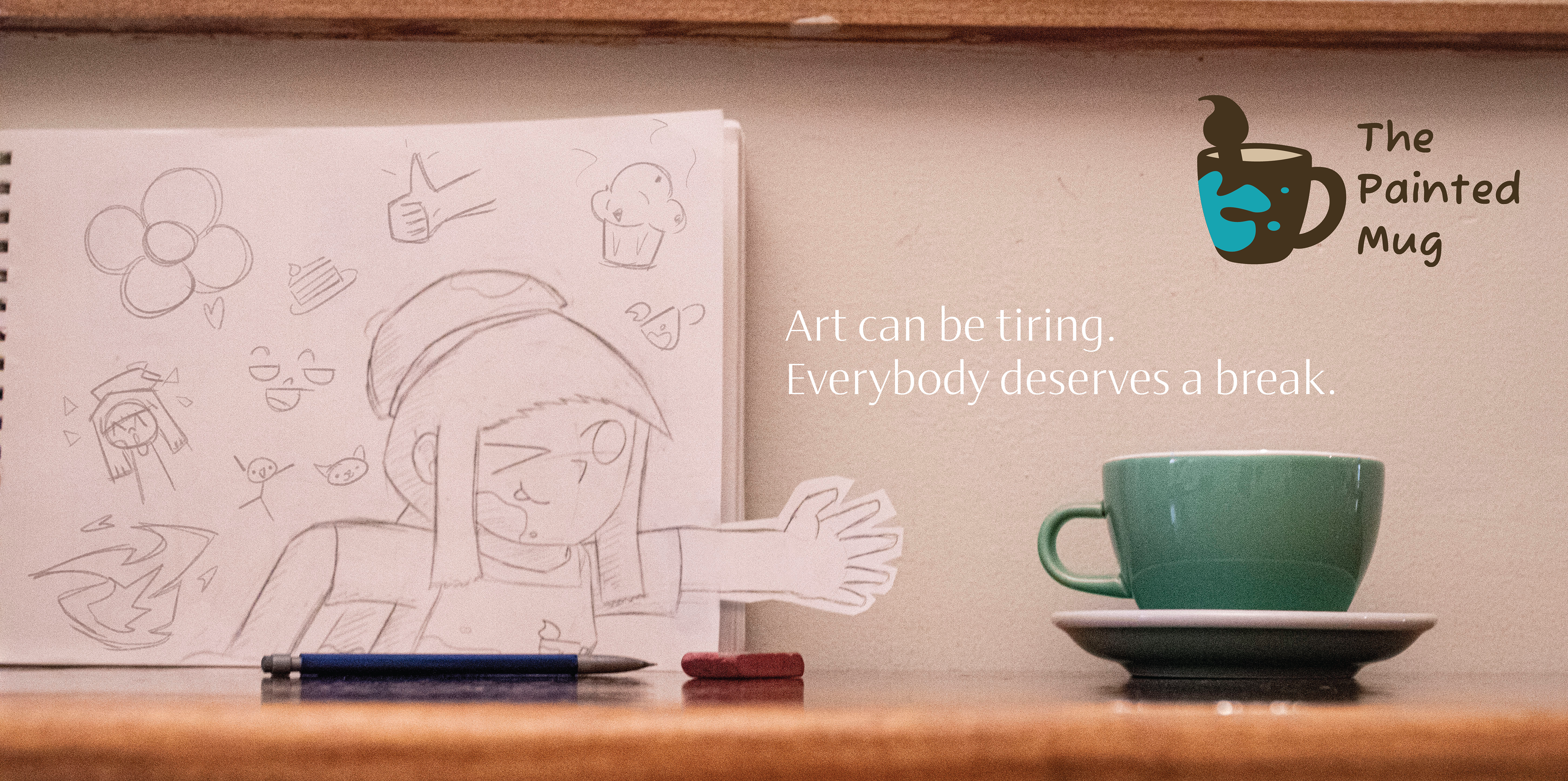
Finalized Advertisements
I took inspiration from old cereal commercials in which the mascot would interact with the product, trying very hard despite it often being out of reach. I felt that the characterization of the mascot would in turn help characterize the café’s atmosphere, while simultaneously promoting the various beverages and pastries that are available. Additionally, I utilized a commissioned painting from a friend of mine for one of the advertisements.

Menu Sketches
The final part of the project was to create a menu to be displayed in the building. I took inspiration from local cafés I visited while working on the previous steps of the project to format the menu. Additionally, I took the time to create a list of themed items to make the identity of the café stand out even more through not just its visual elements, but the food it serves as well.


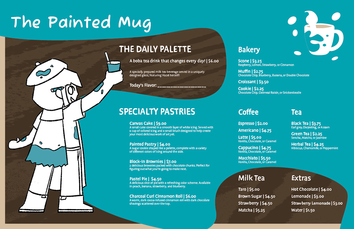
Finalized Menu
I aimed to use a single color scheme that reminded the viewer of coffee through pale and dark, rich browns while also using a splash of vibrant blue to speak for the artistic half of the café. I included a special portrait of the mascot to not only catch the eye of the viewer, but also to direct them to the menu’s contents. The design of the menu is meant to resemble paint splatters and coffee grounds.